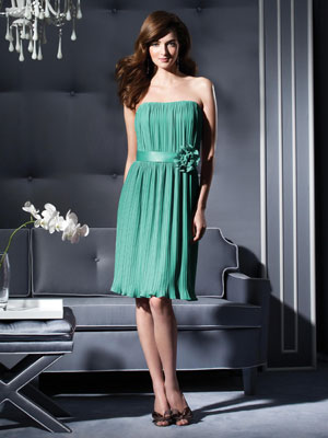
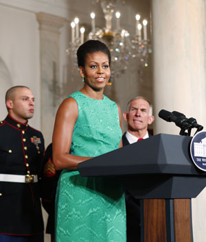
If color is any guide, we’ll be moving into vacation mode in 2010 with the world awash in tropical turquoise, forecasters say.
Turquoise was selected as the color of 2010 by Pantone, a company that supplies and tracks color for fashion and home decor, among other industries. Fashion insiders agreed the color is on the rise.
“Turquoise is universally appealing. It puts everyone in the same state of mind — on vacation,” says Jane Schoenborn, design director at Lilly Pulitzer. “Turquoise for us is a really big color. A lot of times it’s transporting, whether you’re actually going to a resort destination or not.”
Leatrice Eiseman, executive director of the Pantone Color Institute, says there was no runner-up to turquoise in her mind because people crave escapism and freshness after a tough year. The shade is on the cusp of blue and green, which makes it both inviting and serene — characteristics associated with blues — and invigorating and luminous, which comes from green, she says.
“Transporting” was a word many used for turquoise, a shade that takes designer Tommy Hilfiger to the beach, especially the Caribbean, St. Tropez, France, or Southern California, which served as the inspiration for his newest collection. In jewelry, he thinks of the American Southwest, or Central or South America.
“The women in my life wear it on vacation and it looks great with a suntan at the beach,” Hilfiger says.
Interior designer Charlotte Moss says she turns to turquoise to liven up a look that otherwise seems stilted or conservative — and it pairs nicely with a wide range of colors more typical to home decor: gray, navy, black and white. “We’re looking for things that are that are flexible and more universal, and that is turquoise,” she says.
Pantone’s color for 2009 was mimosa yellow, intended to carry a hopeful, optimistic message. Eiseman says the public is shifting gears as the economy shows some improvement: They are ready to fantasize a bit about the beach resort.
She also notes that in many cultures turquoise is considered a protective color with people wearing the blue-stone jewelry almost as a talisman. “You often hear it attached to words like ‘healing.’”
In pop culture, Eiseman has spotted the hue in popular stripe combinations, athletic apparel, nail polish and even eye shadow. It’s also the rare color that is emerging simultaneously in the fashion and decorating worlds, she says.
Cookware maker Le Creuset reports its shade known as Caribbean is increasingly popular, especially paired with unexpected colors such as a vibrant citrus yellow-green and dark blue, says brand manager Kristin Martin.
Customers are using turquoise in both light, coastal-vibe settings and darker, more urban spaces with wood and stainless steel. “I think it’s about bringing spa colors into the home. Turquoise is still a bright color but it’s pleasing to the eye and evoking a spirit of escape.”
But Hilfiger urges a little caution in wearing it. “I love it for women and I strongly dislike it for men. … If men are to wear blue, they should wear light blue or dark blue.”
Other turquoise tips:
—Lilly Pulitzer’s Schoenborn calls it a “buy now, wear anywhere color” because in cooler months it pairs with black and navy, and in the spring and summer it can be worn with white or coral.
—In the home, introduce turquoise through paint, Moss advises. Paint the walls of a room — or just one — or even the ceiling, she says. Painting the insides of bookshelves will give a pop.
—Moss also likes turquoise as the piping on a white couch or as a lampshade or tableskirt.
—Textile quality is an issue with turquoise, says Hilfiger. It can be very luxe looking in the right fabric, but it risks looking cheap in a bad one.
—Pantone’s Eiseman sees it as a potential complement to the yellow-greens that have recently been popular.


